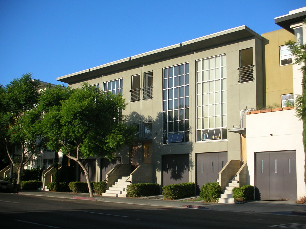
Kettner Row
Unfortunately for the rest of the nation, San Diego really has the perfect climate for modern and contemporary architecture to thrive and I’ve been an admirer of Jonathan Segal’s work for many years, so when I had the opportunity to visit the town for a conference, I seized the chance to experience it in person.
 Kettner Row is located west of downtown, a few blocks from the bay, very close to the Maritime Museum of San Diego (a great detour by the way, should you have the chance I highly recommend it). Set in an area of the city known as the Little Italy Neighborhood Development (LIND), the project was one of several which have helped redefine the community. Not wanting to specifically get into a valuation of the pros and cons of urban gentrification, it will suffice to say that the overall area of the city is very nice, a pedestrian friendly urban environment the likes of which many would aspire to live within.
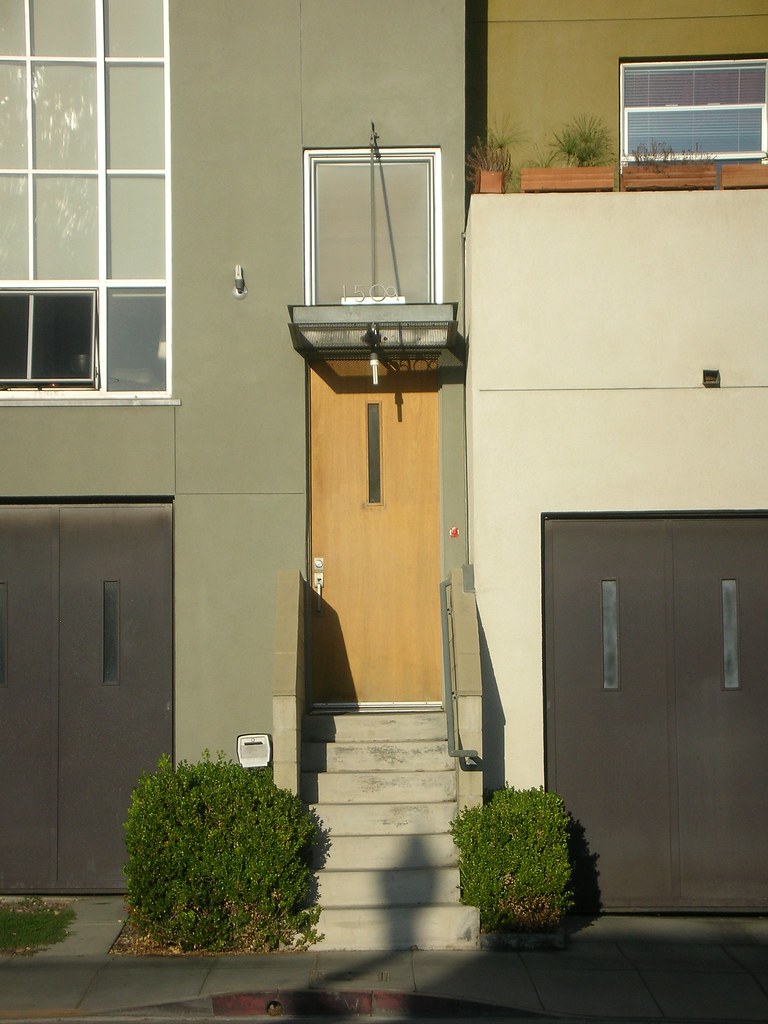 The development itself consists of sixteen live/work rowhouses with granny flats and retail space who front the street with a firm urban edge that is softened by the use of landscaping and materials. While comprising individual rowhouses, the overall composition of the development portrays a more horizontally cohesive “multi-family block” which I find more appropriate to the development’s size and scale. An excellent approach by the architect. Embracing this horizontal unity that so eludes most rowhouse developments, the designer also took advantage of double height spaces within the three story units to blur the distinction between levels (so rigidly personified in multi-family developments) by creating mid-level stoop entries and employing large two story glazing panels.
 My favorite visual device for defeating the hum-drum of most townhome developments are the garage doors. Typically the most painfully “suburban residential” element of any rowhouse or similar high density residential project, the excruciatingly familiar morphology of a rectangle framing horizontal sectional breaks is branded on our frontal lobes. Even when designers try to mask this with elegant materials, or a fixed solid panel (or gawd forbid that “wood castle gate” look) the garage door still screams “car dependent culture”. In contrast, Segal cleverly paints them a dark color (by it’s very nature an anti-garage door color which usually matches a building’s trim) which contrasts profoundly with the entry doors, allowing their light wood tone to dominate,
 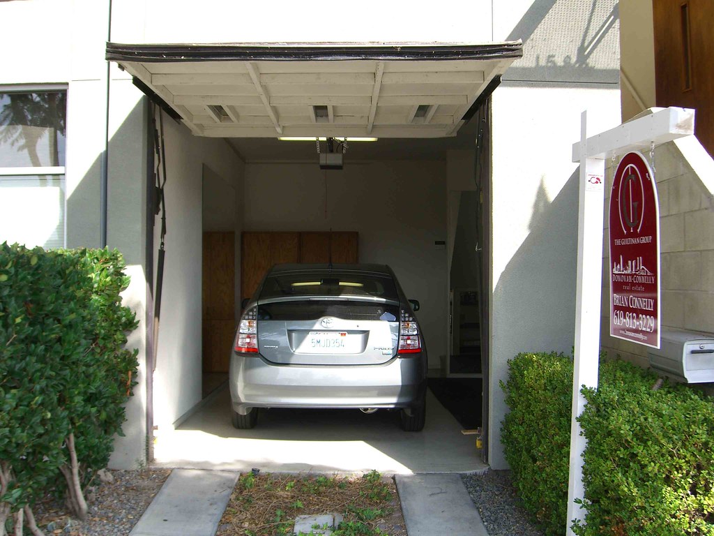 and details them to appear like slim vertical panels, with narrow glazed penetrations. This whilst the whole time they are merely a simple solid panel garage door. In fact, they are nothing more complicated than a 2×4 framework clad in sheathing and cementitious panel. Now when you get close to them, however, it is pretty evident though, and frankly the cementitious panel has worn quite a bit since it really isn’t the right material for this high traffic an area. That said, when the vast majority of people pass the property at 30 mph, and I’d wager they feel much richer and do not communicate as garage doors.
 The streetscape itself is well done, and the gravel between the concrete treads entering the garages further helps to kill that suburban automobile home image. The units themselves help frame an interior courtyard space with personal stoops. I was rather taken at the intricate detailing one resident had done with their space, really claiming a plot within the semi-public realm. They had brilliantly arranged little terracotta pots of modest plants and small cairn-like stone piles all around their patio wall. I thought this a fitting tribute to the project as a whole, whose design felt very determined and calculated down to the smallest detail.
The design has won many awards and while my analysis here is not exhaustive, these are simply a few of the major points I enjoyed. Personally, I tend to be foremost interested in the manner in which massing is broken down as that is almost always the biggest issue I have with multi-family projects. Second is the use of color and materials, and both are executed extremely well in this example.
Garage image via Bonzo McGrue whost Flickr photostream you can view here.
