Alta Henderson
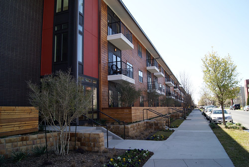
Nestled in along Henderson Avenue in Dallas, a site that is vibrant with new urban activity, the Alta Henderson development makes for a quiet and sophisticated neighbor amidst a lot of architectural clatter. I frankly must admit that I am personally rather jealous concerning this development. Our firm had been asked to produce a conceptual design for this exact site and for an almost identical program, and the design we’d envisioned was a rather revolutionary one for the industry. As a result, I was really sad to see the client sell the land in the pursuit of other ventures. In any event, while the project we designed didn’t get built, the ideas we forged there lead do some intriguing R&D that has since resulted in other work, so it isn’t a total loss.
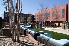 The fascinating point, however, is that the current solution is extremely similar to ours. That isn’t to suggest that there was any exchange of intellectual property, no, I merely find it funny that the architect solved the site almost exactly the same way. Basically an elongated “U” shaped building that fronts the public street edge on one face which then embraces the internal surface and engaged garage parking toward the back alley side. The project is located in Dallas’ MF-2 zoning which restricts the project to 3 stories unless the owner would like to change that zoning with a PD or other legal means. As a result, the cost valuation of the land makes it difficult to park with any structured parking. The architects dealt with this through mostly surface parking and engaged garage parking beneath the units on the parking side. They did a decent job squeezing in some outdoor space, since the site almost completely precludes the opportunity for a true courtyard. That said, while the space is executed nicely, it’s really just a smidge of plaza in the middle of a parking lot.
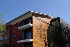 The materials are handled very well. While all the facades are largely flat in order to maximize the amount of net rentable on the site, the way they break up the exterior work. By varying color and texture between a dark brick color, stained shingles, and stark red cementitious siding, the face is executed with a substantial amount of visual movement, defying it’s geometry. There are some poorly executed details, the balcony cladding chief among them with a very “garden apartment” look to the cementitious board & trim, but for the most part, the design is executed very subtlety.
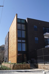 I really like the stack bond of the brick, and the sloping soffit at the overhang. The exit stairs are also well designed with very clear opening and hierarchy. Of interest, I typically see parapeting at the street side of a design and sloped/shingled roofs toward the back or courtyard side to save money, while utilizing the parapet look as a more urban morphology. Here they do precisely the reverse, and I think it works. A fear I see a lot of the time from owners and cities is a concern that a long, uninterrupted roof line is to a project’s detriment, but the roof line here is only broken once, at the vehicular entry near the center of the facade. I think with the narrowness of the street one is put at a perspective where this is less of an emphasis. While the building touches the ground easily enough, the patios and wood railing fencing them off lack a similar grace. They feel more like a wood barrier wall than an effective divider of space, but I do appreciate that they are low, and not high fences.
Overall I’m really impressed and am happy to see such a quality development occur on this stretch of Henderson where such a brick-a-brac of differing style had begun proliferating.


