How to Ruin a Good Design By Adding Value
There are as many different types of architecture as there are motivations for building something. Individuals want their dream home in which is bound up all their hopes and desires for the future. Corporations want a headquarters that is an iconic embodiment of their industry. Theater companies what a vibrant and engaging space that is a vehicle for creativity. With every design there is excitement, hope, and pride.
Mostly.
For the merchant developer, this is different. Real estate companies with development arms are responsible for a vast majority of what we experience in the built environment. They are the malls, strip centers, big box retailers, office buildings, medical centers, etc. that we go in and out of every day, and they play by a very different set of rules.
I learned a long time ago never to be too overly critical of any architectural design. While most people think it is the exclusive role of the architect to generate what a building looks like, their role is far more subtle and expansive, dealing primarily with management. Management of the documents, management of the consultants, management of the budget, but chiefly, management of the client. After all, this is the client’s building, no the architect’s, and why they makes certain decisions is often cryptic.
Clearly, economy of design is a driving factor. Budgets are set for a reason, and few clients can arbitrarily ignore a budget out of whim, and it is the responsibility to achieve the client’s goals within a cost conscious framework. This leads to certain design decisions, as real as any programmatic or environmental condition that must be taken into consideration. In my world, we do a lot of wood-framed, mixed-use urban development, often with a retail piece on the first floor and something like 3 or 4 stories of residential above. In most markets, the assumed cost structure for this allows for the materials along the base to be brick or stone with storefront glazing, and the residential above to be a less expensive material like stucco or siding, with residential windows.
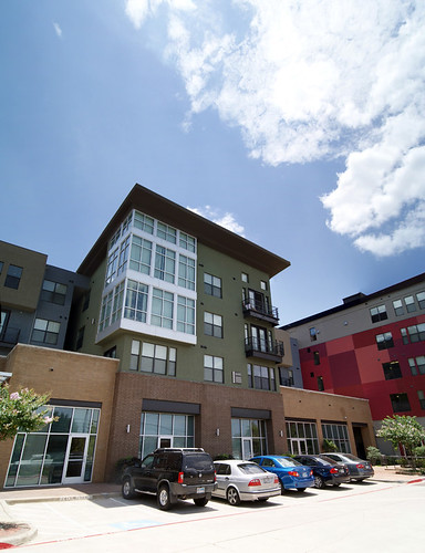
Now, as you can see in this example, the two upper units have bay windows that project out with full-height storefront glazing, which immediately violates the general rules, but what happens is this leads the designer down a path of robbing Peter to pay Paul. Where can you incorporate more cost effective materials so you can use more expensive materials in other locations?
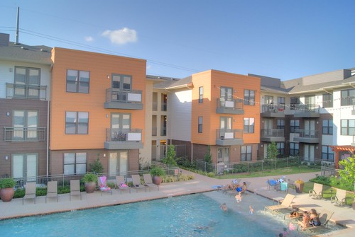
Here’s an example where we incorporated cementitious siding in a courtyard so that we could utilize other materials on the exterior. While one might assume this is in some way “cheapening out” it isn’t, any material can be used to create engaging and dynamic architecture, but the key here is that the architect chooses how to use the material based on the design tool they have available to them.
Unfortunately, what ends up happening all too often with merchant developers, is that they always have an eye on if (or all to often ‘when’) they are going to sell this particular property. Unlike the home builder or the corporation or the theater company, this often transient condition of ownership leads to a unique set of design constraints…the “value add”.
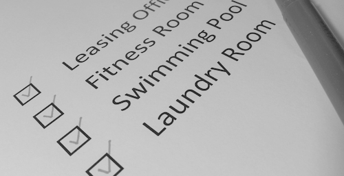
We make jokes that we need to appease the “bean counters” in New York when this topic comes up, but it isn’t too far from the truth. The vehicle of this circumstance is the lending institution who doesn’t know or care anything about design. They classify properties by letter grade, and check off a list of required points to asses the quality of construction. This means that there are several programmatic requirements that must be adhered to: Does it have a leasing office? check, Does it have a fitness center? check, Does it have a swimming pool? check, and on and on.
This leads to a whole host of issues in and of itself. In response to trends we’d been seeing in projects where the small studio units would fly off the shelf, and large two bedroom units would languish, we developed a micro-unit concept that specifically catered to areas of cities where young urban professionals wanted to live, but couldn’t afford larger units. We knew it would work, the clients knew it would work, but it took several years and one of the most severe recessions in our history to make the idea work because lenders simply couldn’t fathom deviating from their list which clearly told them “You must have 70% one bedroom units and 30% two bedroom units”. Eventually a lender willing to take a risk was found, and the units have been an enormous success (as we’ll all see in the November issue of dwell magazine…stay tuned).
What this sort of thinking engenders, however, is a piecemeal approach to design that only makes sense on a balance sheet. I recently had a client ask me, during a design presentation “So is this entire elevation stucco?” and I replied that it was. Following the aforementioned design methodology, we’d chosen a couple of the facades to be predominately stucco, so we could utilize a more expensive panel and the main entry with the leasing, fitness and clubs rooms. The design wasn’t “cheap” in fact, it was very dynamic and similar to this other project we’d done:

The client immediately countered, noting that his lenders expected quality materials on every elevation and that as brick or stone was considered by them to be “quality” we should add that to this facade, and every other elevation that didn’t have it. This, my friends, is the very basis for “value added” design. It considers a design as a list of essential components that can be checked off and graded. It takes nothing into consideration like sun angles or color values, building orientation or sense of entry. No, it reduces architectural design to a list of pieces that, when indiscriminately combined supposedly equal quality.
To show exactly how unfortunate this can be, let us consider that in many North Texas communities, their are code requirements for all single family homes to be largely composed of a brick or stone masonry exterior. This is a phenomenon that I believe struck some time in the 80’s and continues today. The general feeling is that homes clad in brick are of a higher “quality” than those that aren’t or at the very least, brick homes do not degrade property values in the way that homes clad in siding or stucco would. The requirement is typically something on the order of 80% brick, and while the intention is to enhance a house, it often leads to this:
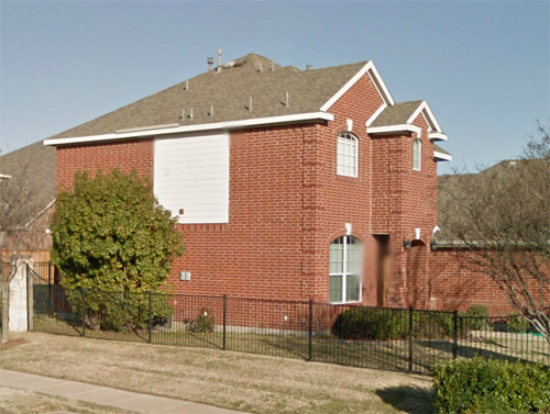
When the developer or contractor reaches that prescribed percentage, regardless of the aesthetic, they just fill the rest in with the least expensive material they can lay their hands on. That square panel of siding represents the remaining percentage of house that wasn’t required to be clad in brick. As absurd as this looks to any observer, it makes sense on a checklist in New York, and thus, the bean counters are happy.
I see this “value added” influence more and more and am constantly fighting it with clear, logical arguments, but unfortunately, there is no fighting with a checklist. A critique of many designs I regularly hear is their repetitive, unimaginative uniformity when it comes to a particular project type. This is an enormous factor that leads to that mediocre design hegemony.
Fortunately, there are still good clients out there who see beyond the list, and have the wherewithal to manipulate the bean counters to see the big picture, or at least trust them with seeing the big picture. It’s just another unfortunate hurdle in our path to good design.