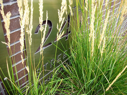
Sophisticated Modernism |24th Street Townhomes|
The last time I was in Denver I drove around and explored a lot of the new infill projects that have cropped up in the Five Points region of the city, just northeast of downtown. The 24th Street Townhomes is a fine little project that at the corner of 24th Street and Glenarm Place, and from what I can tell, consists of eleven 3 story units arranged around a central parking court, with the back units overlooking a small green space.
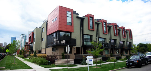 Being on a street corner, the architect had to address both sides of the street, the main address on 24th and the side at Glenarm. All too often designers slap towers on the corner(s) of a building, and the urban landscape is replete with the overused technique. If I achieve nothing else with my career, I hope that I can lessen the burden of urban housing minarets imposed so liberally by creatively lacking designers (you may see me rant on this on occasion, it’s rather a pet peeve of mine). There are many alternative ways to turn the corner of a building, and I think here the architect does that successfully. The morphology of the element, pushing out with a bay window that wraps both sides, relates very well to the roofline penetrations of the adjacent units in form and material. Suggestions of apparent verticality (as one would want in a corner tower piece) are achieved, without technically differing in height from the adjacent forms.
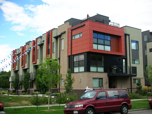 As one moves around to the back side of the development, the designer sidesteps another trap, that of blindly replicating the original design for the sake of economy, lack of creativity, etc. No, the facade, though of an entirely consistent vocabulary as the front, communicates a different story (although maybe less successfully). The bay windows are a variant of those in the front, but feel a little weaker and less prominent, and the corner element suffers from a panel of brick awkwardly slapped against it. It feels rather like the front elevation was drawn, everyone liked it and the decision was to make the obverse “the same but different”. While this is a strategy that can work to carry a design through an overall composition, and does here to a certain extent, it also rather tricky because it becomes very restrictive, walling in the designer and limiting their creative options.
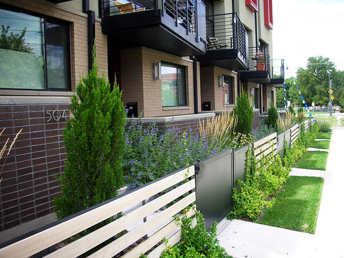 One of the most successful elements of the design is the landscaping. So many urban projects fail to appropriately deal with the streetscape, despite it’s incredible importance to the perception of the design. Residences need a sense of security about them, especially in urban settings. Rooms on the ground floor, particularly bedrooms, require this to an even greater extent. The best solution is to raise the building off the street somewhat, but on flat site that requires the expensive importation of fill dirt. Here, the designers do an excellent job, in very little space, of visually elongating the space between the ground floor of the units and the street by layering the landscaping. First a small strip of grass, then a narrow hedge followed by a horizontal wood slat fence with a gate, then more vertical landscaping in taller grasses, shrubs and ornamental trees, and finally low walls framing modest private outdoor space. All of this occurs in less than 10 feet from the face of the building to the walk.
Overall, the composition of materials is very well done as well, successfully breaking up a largely flat building and creating a great degree of visual interest. The downspouts however, the bane of my and many designer’s existence, clutter portions of the facade, especially on the back side, and are distracting. Probably the most overlooked design element because they sound so trivial, downspouts are actually one of the hardest things to get correct. Even if you systematically plan their placement to have a clear vertical shot down, avoiding obvious things like windows and balconies, and even if you are sly enough to coordinate them with the location of exterior lighting and exhaust vent locations, and even if you have pre-construction meetings with the downspout installation crew to make sure they understand all these things, you all to often get a roof construction by the carpenters that place the actual location of the downspout just far enough off the design as the spiral completely out of control. Like I said, bane of my existence.
All in all, this is an excellent project and I encourage designers to definitely check it out if you make it to Denver.
